O&W DEsign & BUILD
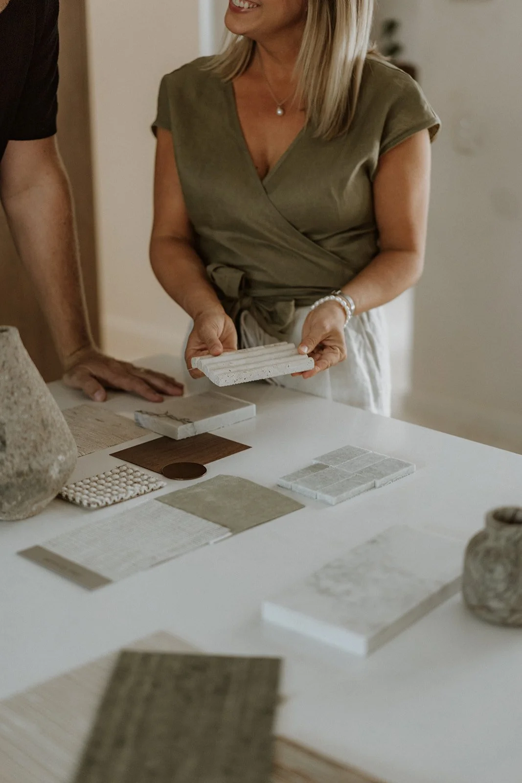
During the rebrand of O&W Design & Build, it was essential to balance the femininity of interior design with the masculinity of construction, reflecting Oliver & Whitney's harmonious partnership. The brand also needed to exude sophistication to appeal to high end clientele while ensuring the logo was distinctive and memorable.
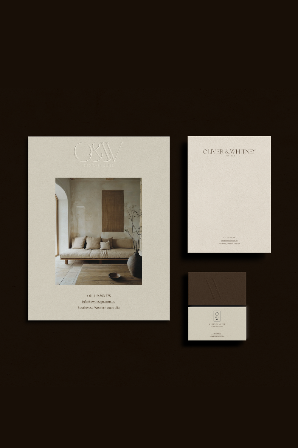
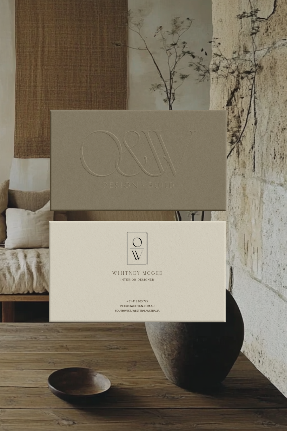
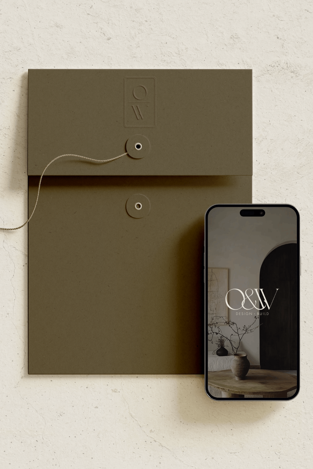
This was achieved through a thoughtful approach to typography and logo design. The primary logo pairs an elegant serif font for “O&W” with a clean, contemporary typeface for “Design + Build,” seamlessly blending the two aspects of their business. A custom monogram, featuring the intertwined initials “O” and “W” with an elegant ampersand, serves as a distinctive and sophisticated brand mark, ensuring their identity stands out.
The brand colours chocolate, olive and taupes - were carefully chosen to evoke warmth and refinement, drawing inspiration from high end interiors. These tones enhance the luxurious yet approachable nature of the brand.
The resulting cohesive identity perfectly encapsulates O&W Design & Build’s ethos, blending personal charm, timeless elegance, and modern functionality.
design services
BRANDING
LOGO DESIGN
WEBSITE DESIGN
BRAND PHOTOGRAPHY
COLLABORATIONS
CAROLINE MOYLAN PHOTOGRAPHY