Yallingup Zinc
Welcome to the world of Yallingup Zinc, a company situated in the picturesque Yallingup, WA crafting natural zinc sun protection products.
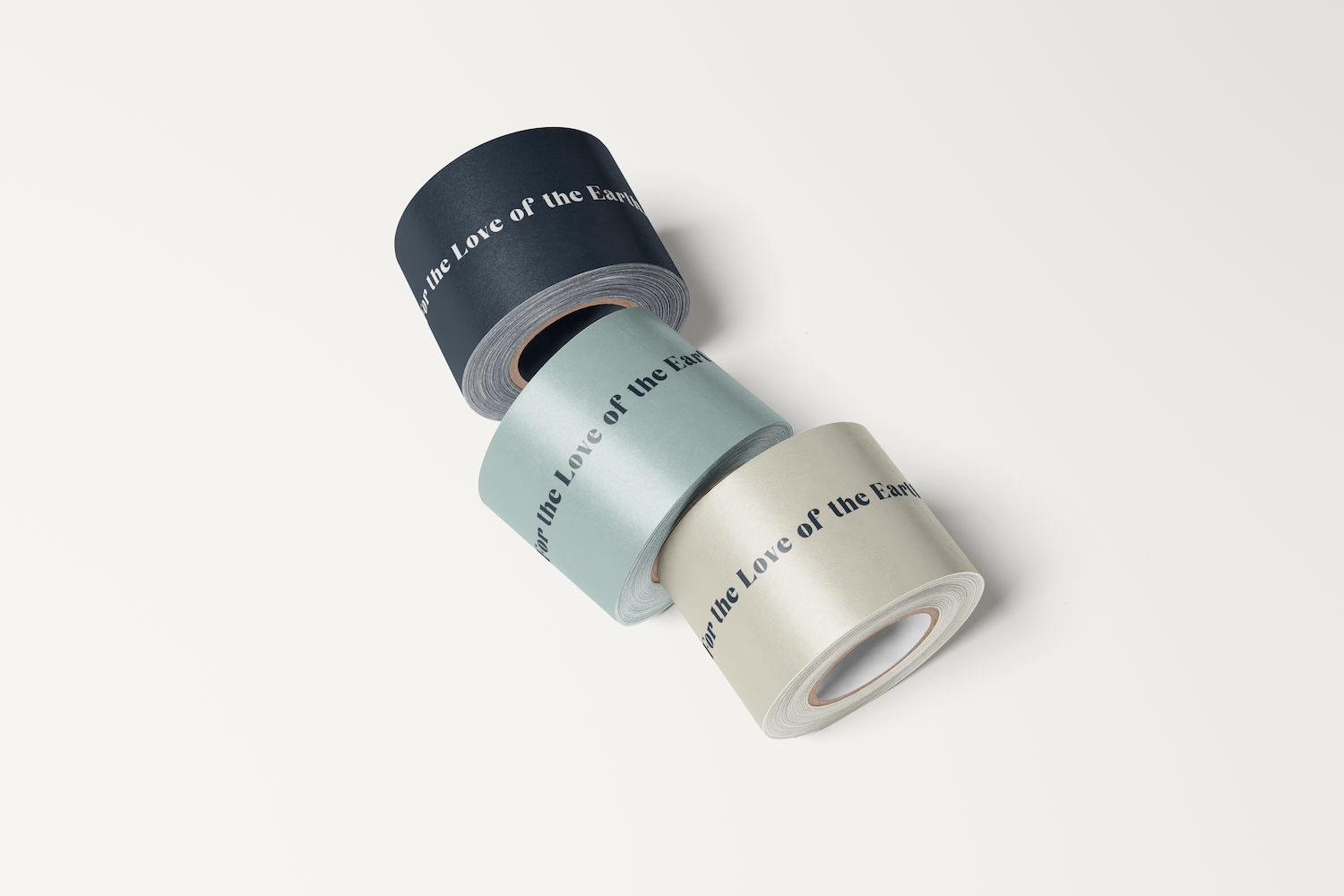
The rebranding process involved a careful and detailed approach to creative direction, with particular emphasis on the tin label design as the central element of the brand. The 50mm label size limited the available space to convey the brand's personality. Hence, we incorporated topography artwork and a fun bold font to effectively showcase the brand's identity.
The topography artwork captures the essence of Yallingup. It signifies the brand's local roots, its environmental consciousness, and a dedication to preserving the region's natural beauty. The rich color palette of blues, turquoises, deep terracotta reds, pink clays, and sandy beiges tells a captivating visual story. It encapsulates the iconic colours of Yallingup Beach and the deep red earthy tones of the Pilbara region, where the product is stocked throughout retail stores. The pinky clay tones represent the product itself.
Furthermore, a brand photoshoot was held at Yallingup Beach, where a diverse array of skin types, ages, and leisure activities were captured. This resulted an impressive collection of imagery intended for use on both the website and various social media platforms.
In every aspect of the creative direction, Yallingup Zinc's visual identity resonates with its mission to redefine beauty by demonstrating that high-quality skincare can go hand-in-hand with sustainability, inclusivity, and community engagement.
design services
BRANDING
LOGO DESIGN
WEBSITE
BRAND IMAGERY
PACKAGING DESIGN
COLLABORATIONS
PHOTOGRAPHY: Caroline Moylan Photography
TOPOGRAPHY ARTWORK: Dave - Small Silences