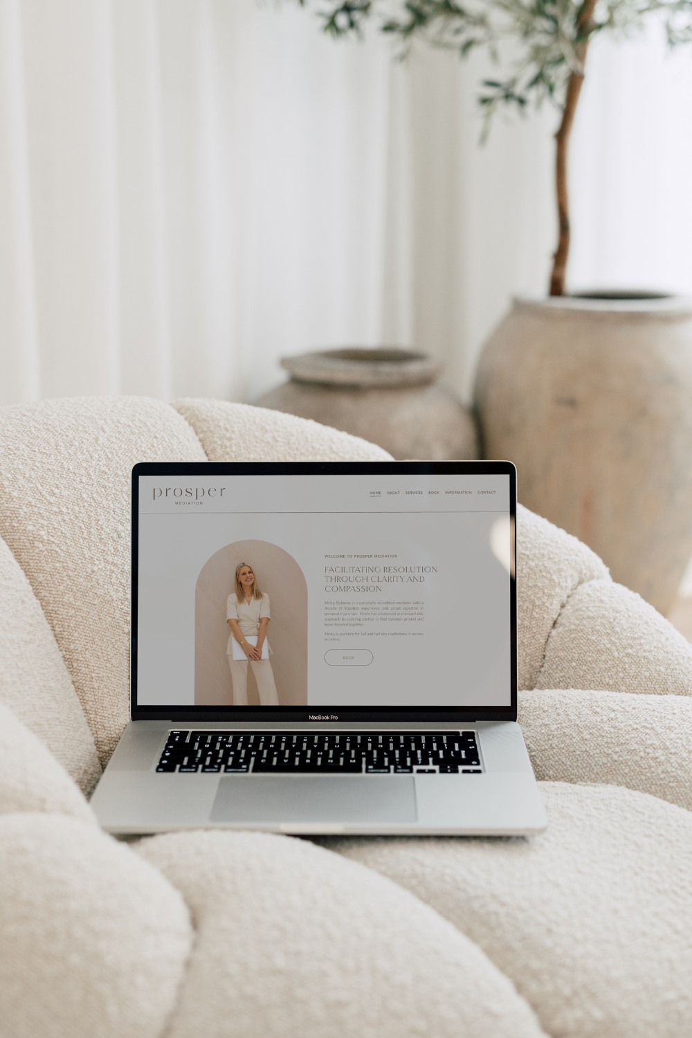
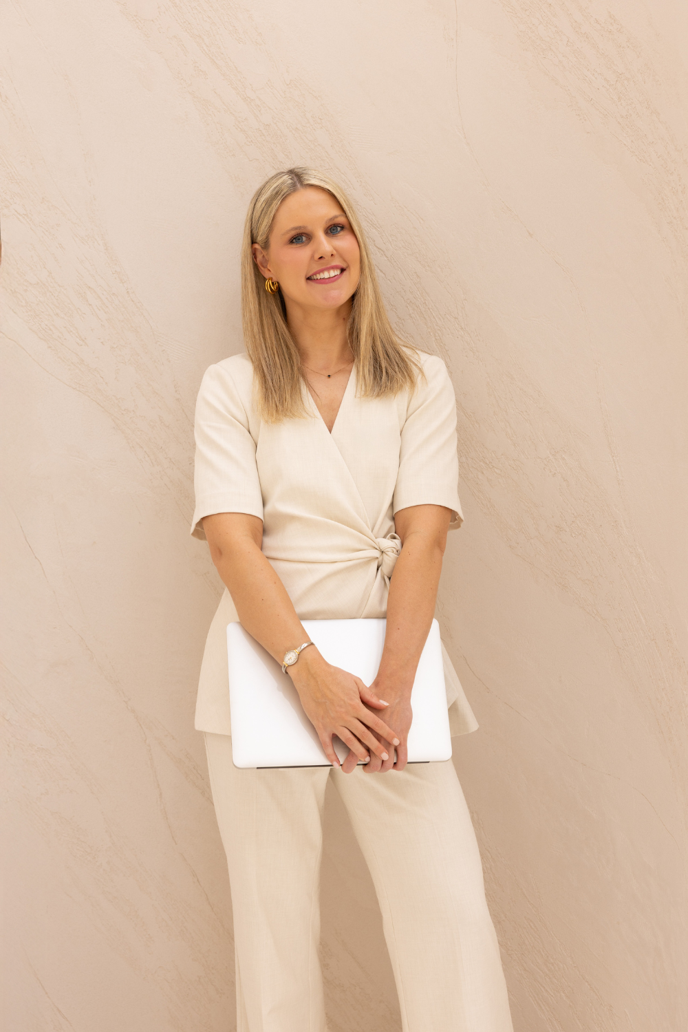
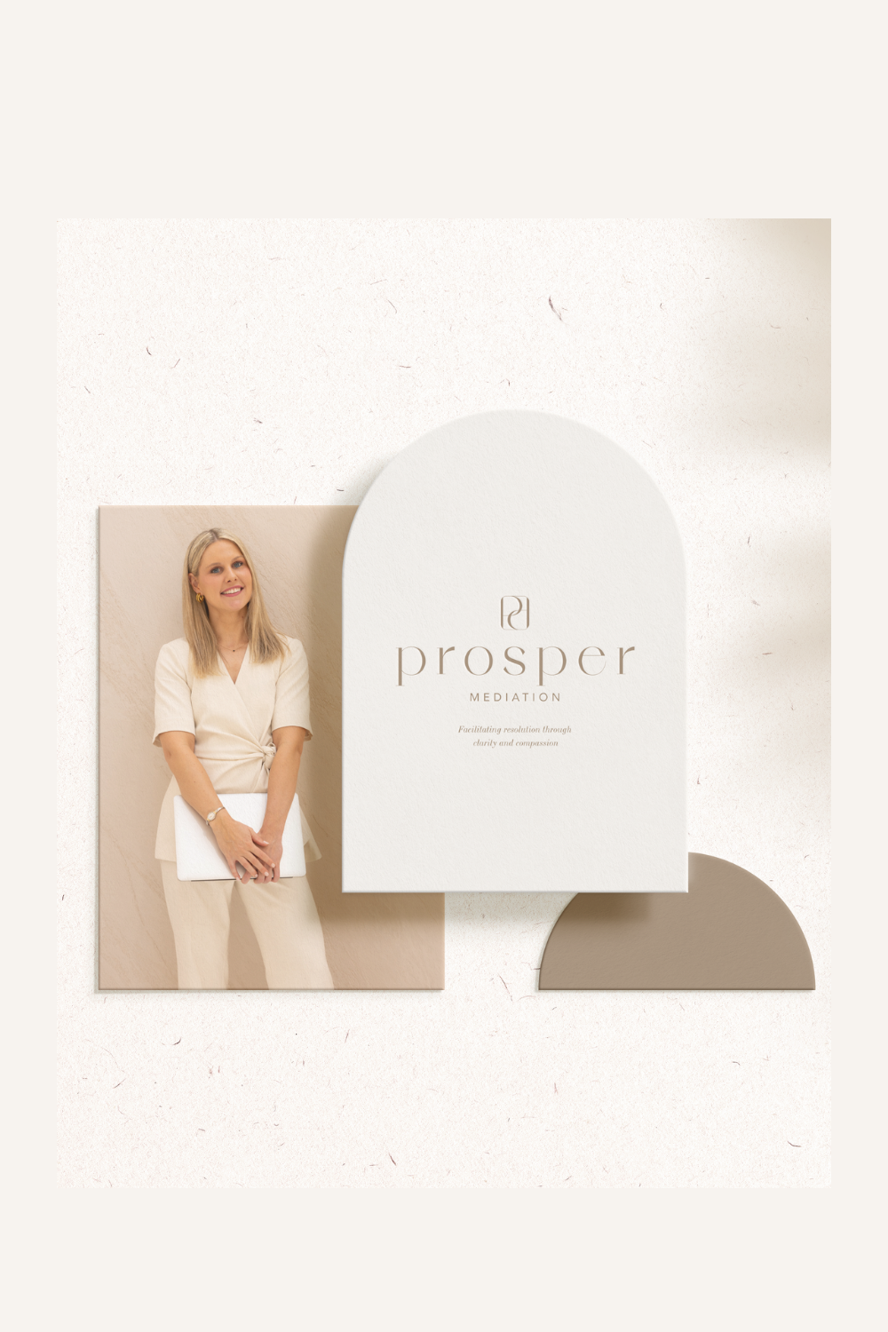
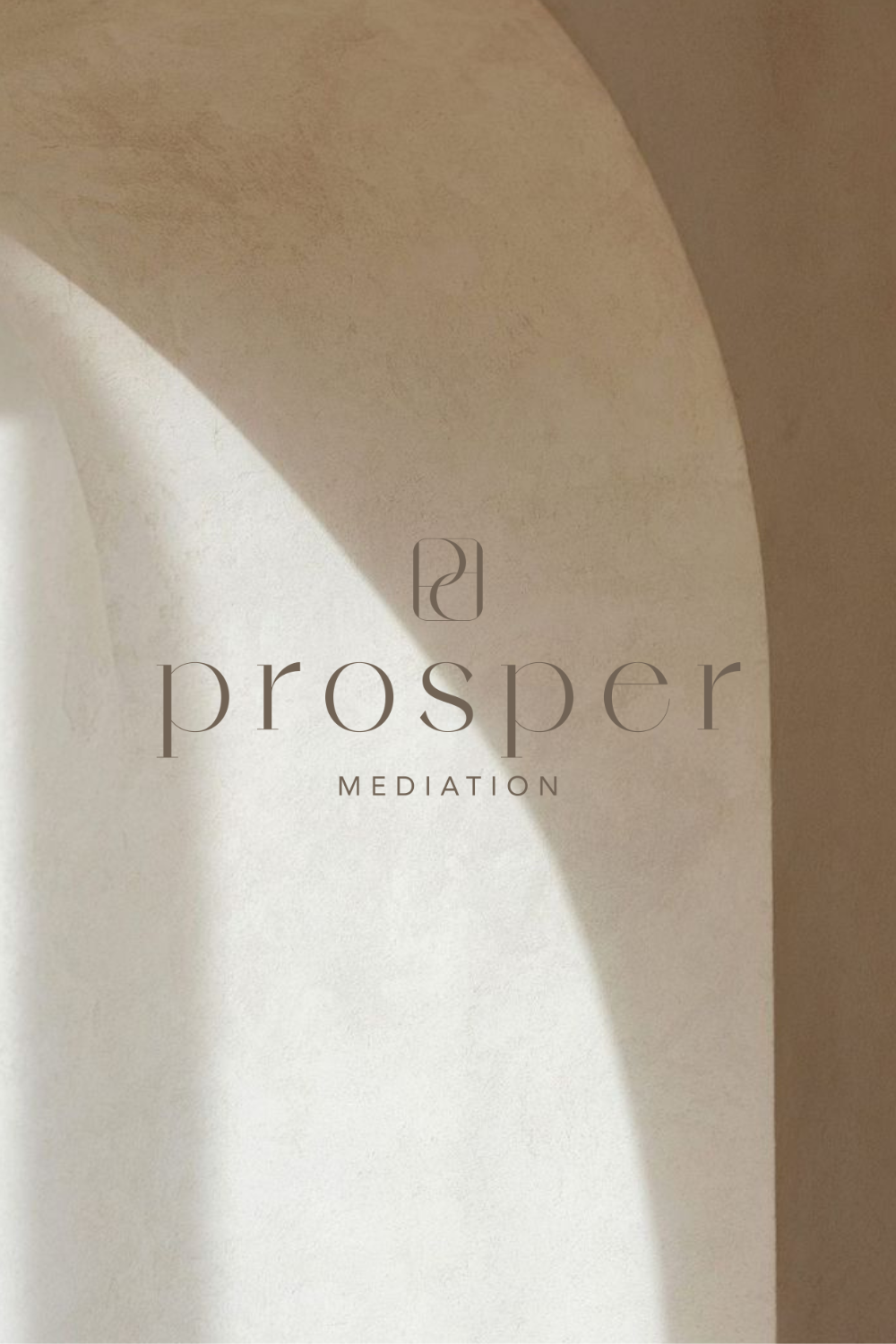
prosper mediation
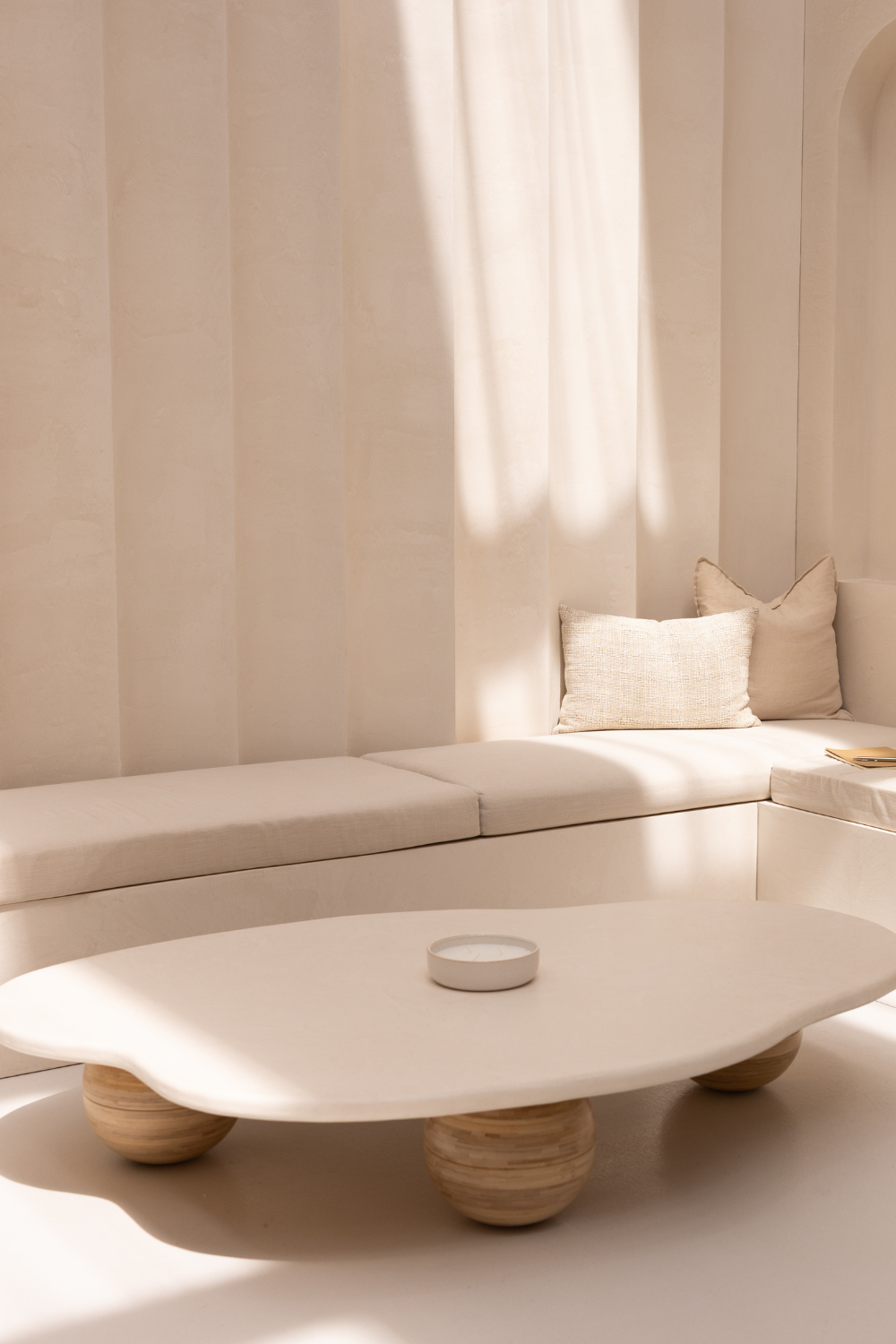
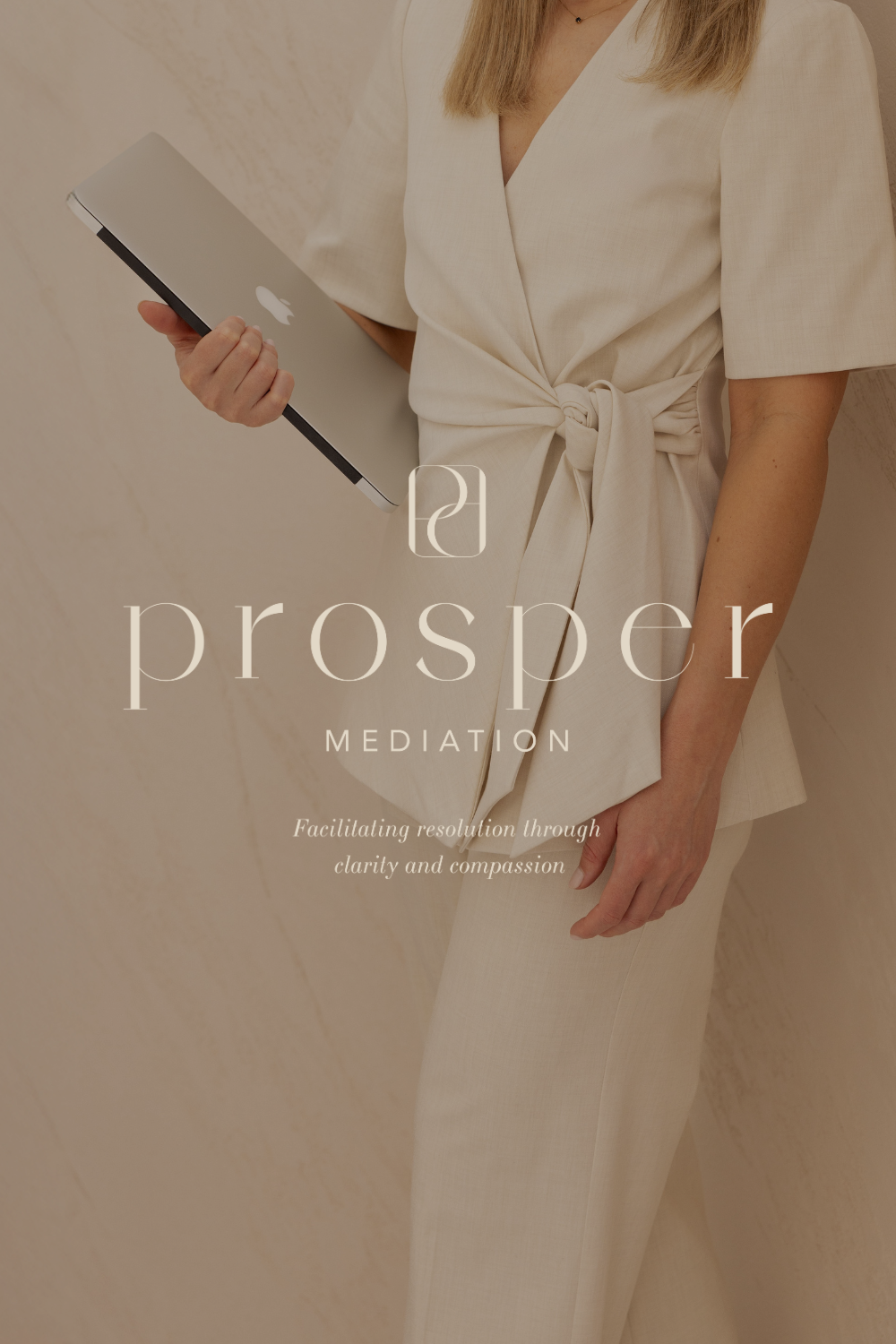
Designed as a softer alternative to traditional legal branding, Prosper Mediation’s identity draws on calm, minimal aesthetics more often seen in wellness spaces. The brief was to create a brand that felt elevated and considered, with a subtle Japandi influence, stepping away from the heavy, corporate styling common in the legal space.
The lowercase wordmark was designed with generous spacing to create a sense of calm and approachability, avoiding anything that felt overly assertive. A tonal, earthy palette reinforces this softness and clarity across the brand.
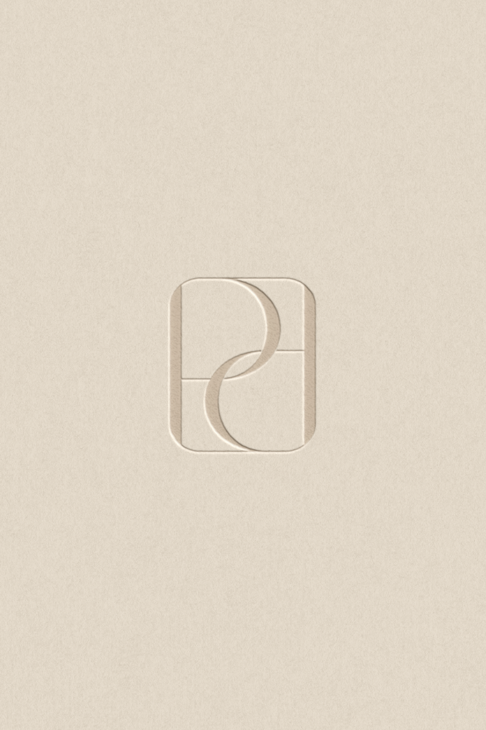
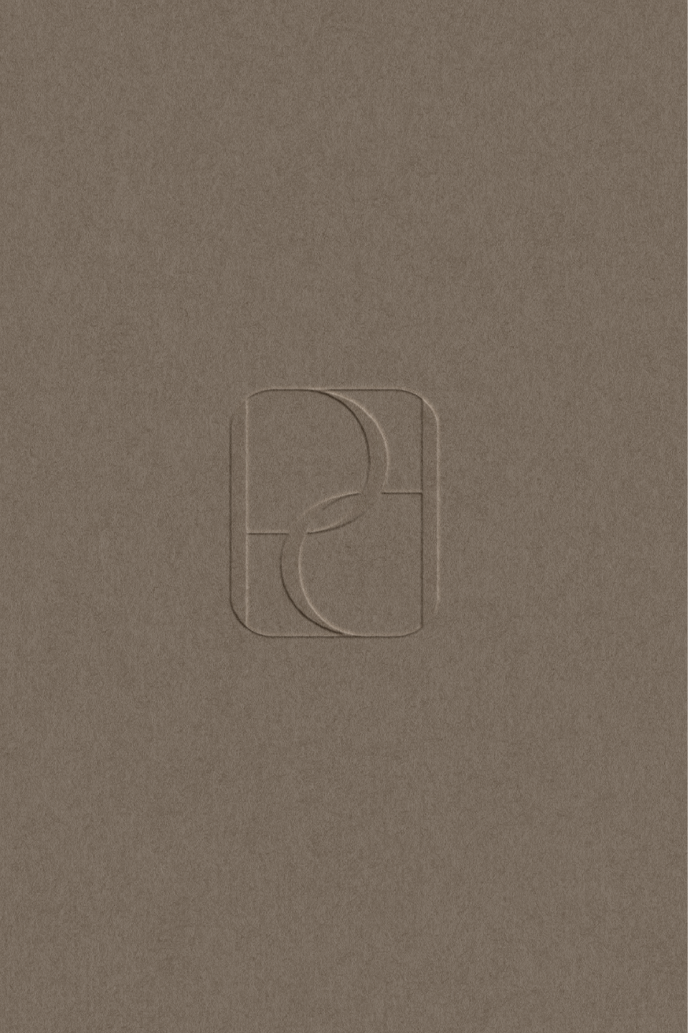
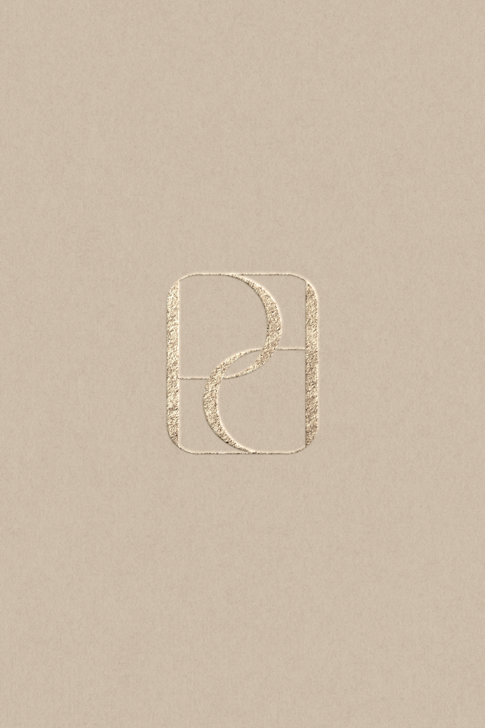
The brand mark features a mirrored letter P encased within a delicate frame, symbolising balance, structure, and mutual understanding at the heart of the mediation process.
design services
BRANDING
LOGO DESIGN
WEBSITE DESIGN
COLLABORATIONS
PHOTOGRAPHY: Priscilla Hope Photography